Last updated on July 7th, 2020 at 06:43 am

It is 2019, and capturing reader’s attention & holding them hostages until they read the last line is tricky. The human attention span is going down the hill at a scary rate.
And do you know what?
Using stock photos in your content blog doesn’t help you with delivering the best visual content strategy.
You may wonder that stock photos are professional looking photos & there are websites where you get them for free. That is right; hands down!
Do not be tempted by the value proposition of it being cheap & easy grab.
There are fatal consequences to using stock photos in your blog.
To simplify, here is the list of Free stock photos sites you use and the ones you've never heard about
1. Pexels
2. Rawpixel
3. Pixabay
4. Unsplash
5. Canva
6. Stocksnap.io
7. Burst (by Shopify)
8. Reshot
9. Gratisography
10. Freestocks.org
11. Picography
I will need to create an entire post dedicated to the list of Free Stock Photos sites. Fortunately, the goal of this post is to make you understand why that’s not the right thing to do & what should you do instead.
Let’s take a look at some of the reasons why you shouldn’t use stock photos in your blog. Read till the end. Along the way, I will share examples of Bloggers featuring outstanding visual content in their blog post.
1. It appears spammy:
I know this sounds straightforward, but that’s how it seems. Putting stock photos in a blog is like protruding yourself as someone that you are not.
People visiting your blog wants to see the real you. Stock photos defeat the very purpose.
Making everything look perfect more than it should be, instead makes it look fishy.
Here is the think, we use images to connect the dots. Even Google cares about the images you use.
The best SEO Practices suggest that we use images to make sense, break the monotony of reading the rather lengthy blog post. We often come across Neil Patel’s videos that stress the significance of using relevant images in your blog posts.
Your blog’s featured image is like the base of the pyramid; it sets the tone of your blog post. If the first piece of the puzzle is itself ambiguous, then you shouldn’t wonder why people abandon your blog post as soon as they get there.
leaving you scratching your head (I wrote an epic piece, but my Google Analytics Behavior report suggests that people coming to this post don’t even stay for a minute.)
2. Why would anyone Pin a stock photo?
It’s more of a question than a point, but it does make a compelling point. I have contemplated much about Pinterest Marketing on the Social Media Marketing Guide.
Pinterest is a Social Bookmarking-cum-Social Media Marketing Platform. Over this platform, users discover unique designs & infographics which they pin as a means to save the content.
Much of the pins on Pinterest are from website & blog posts. If you are a WordPress Blogger, then you must be familiar with Pinterest Pin it button Plugin. That plugin allows users to save images from your website to their Pinterest Board. Now let’s do a thought experiment. There are Two instances, think of it as A/B Testing.
#1. A visitors come to your blog post & finds stock photo as a featured image
#2. A visitor comes to your blog post & finds a custom designed featured image that sets the tone of the context.
Now think which one will convert better. In this example, conversion means scrolling down & reading the blog post. Go ahead, think about it this blog post isn’t going anywhere.
Are you back yet?
Be honest, and tell which one would convert better #1 or #2??
I bet it’s #2 😏
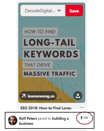
Pinterest Boards features rich pins that are unique, aesthetic & educational.
Check out the above Pin. It’s an image from blog that has been repinned 599 Times. If you go over to that blog from where it was pinned, you can find it on Social Share stats that the blog post has been shared for +2.1 K Times.
3. You lose the element of Brand Identity:
No visual content strategy is ever complete without the aspect of brand identity. Brand Identity is present at the heart of Visual Content Strategy.
“Today people don’t trust companies. One of the things marketers want to do is to humanize their brand. What better way to do it than put a live person in front of them?”
– Jackie Huba
There is a reason why I just quoted Jackie. It’s to emphasize the need for humanizing your brand. The visual content strategy that isn’t answering the questions like, “Is your brand Human?” is not creating advocates for their brand.
How do you Humanize your Content Strategy?
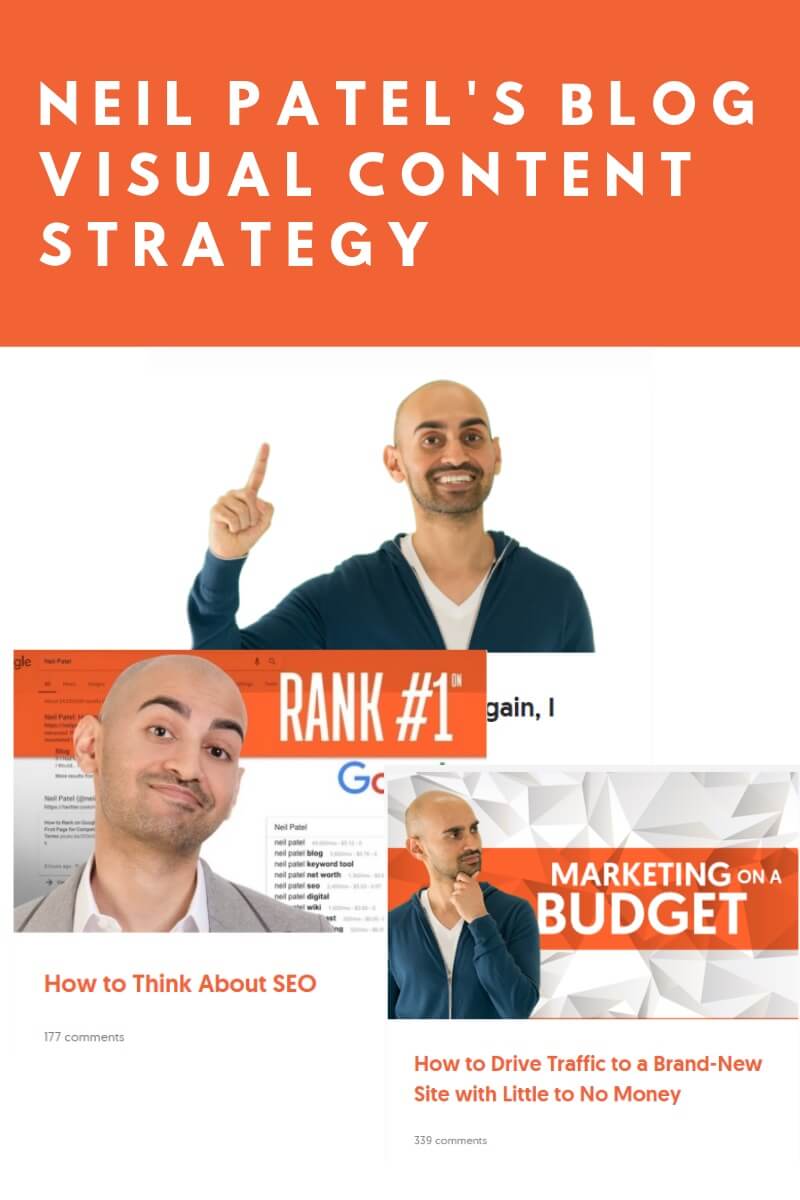
Not with Free Stock Photos, That’s for sure. To humanize your blog visual content, you have to use custom designed blog graphics, maybe your picture with text on Image. Neil Patel & Buffer does a great job on their blog with a personal image added with relevant text.
As for custom designed blog images, a great example would be Matthew Woodward’s Blog. Matthew aligns his Blog visual content with his Brand colors. i.e Pink & Blue. The way he represents the combination of two feels agreeable to eyes & strikes a balance.
4. Google Image SEO:
The whole game around Google Image SEO revolves around image alt attributes. But there’s another factor that people often miss out. It’s the user’s search intent & user experience.
With smart Image Alt Attributes Placement, you can ignite your visibility in Google Image search, but what about search intent?
There are times when a user performs an image search deliberately to uncover some unique designs, aesthetic infographics that excites curiosity.
Google Image Search is a gold mine for the traffic, especially if your niche is lifestyle, food & entertainment. People interested in these niches voluntarily performs image search just for fun. Your blog can feature exciting images that will tempt them to check out your article over it.
What would happen if users come across stock photos as they search for images on Google Images?
Here’s the thing, stock photos are overused to the extent that even people not belonging to the industry of advertising can identify if they see a stock photo or an original photo.
(Obviously, both the images are authentic, the difference is that one features perfection using models, whereas other is willing to showcase vulnerability by exposing their pictures that aren’t shot to perfection under the supervision of a professional photographer)
Wait, there’s a counter-intuitive solution to this ruckus!
What if I told you, that you can consolidate Free Stock Photo with Vectors & Font to create a unique design of your own?
Yes, that’s the counter-intuitive solution to this mess. A Free Stock Photo on its own exudes the vibes of laziness. Vectors all on their own cannot make sense. But when the three i.e Stock Photo + Vector + Fonts are consolidated you get a unique design. Your readers get the context.
Want to make easier?
head over to Canva & consolidate the three to produce remarkable designs. Heck, they even have prepopulated templates that will help you create designs. You may even get inspired to create permutations of existing templates to create the design that looks unique from scratch.
Winding up:
Using Free Stock Photos as it is without any customization will make you lose the element of Brand Identity. People would not recall your brand as they come across your blog’s visual content over the web. You don’t have to be a Photoshop Wizard or a Model or a Professional Photographer. All you have to do is make use of Free Designing Tools like Canva. Consolidate stock photo + Vector + Font + Brand Color to produce unique designs.

Kunjal Chawhan founder of Decode Digital Market, a Digital Marketer by profession, and a Digital Marketing Niche Blogger by passion, here to share my knowledge


